
Enhance Experience with User-Friendly Web Design
- hauntseekers21
- Oct 13
- 5 min read
When I first stumbled into the world of haunted attractions and paranormal exploration, I was hooked by the thrill and mystery. But what kept me coming back wasn’t just the eerie stories or spine-chilling experiences—it was how easy it was to find what I wanted online. A website that’s confusing or clunky? Nope, not for me. That’s why user-friendly design is a game-changer, especially for platforms like Haunt Seekers aiming to be the go-to haunt hub.
Let’s dive into why user-friendly design matters so much, how it can transform your experience, and some practical tips to make it happen.
Why the Importance of User-Friendly Design Can’t Be Overstated
Imagine you’re browsing for the next haunted attraction to visit. You want quick info, clear directions, maybe some reviews, and a peek at merchandise. If the website is a maze, you’ll probably bounce off faster than a ghost vanishing at dawn. That’s the harsh reality of bad design.
User-friendly design means making websites intuitive, accessible, and downright enjoyable to use. It’s about anticipating what visitors want and delivering it without fuss. For a niche like haunted attractions, where excitement and curiosity run high, a smooth online experience keeps the thrill alive.
Here’s why it’s crucial:
Keeps visitors engaged: If your site is easy to navigate, people stick around longer.
Builds trust: Clear, organized info feels professional and reliable.
Boosts sales: Whether it’s tickets or spooky merch, a simple checkout process seals the deal.
Encourages sharing: Happy users tell friends, expanding your haunt community.
So, if you want to grow your haunt fan base and merchandise sales, investing in user-friendly design isn’t optional—it’s essential.

Key Elements That Make User-Friendly Design Work
Now, let’s get into the nitty-gritty. What exactly makes a website user-friendly? Here are some must-haves that I’ve noticed make a huge difference:
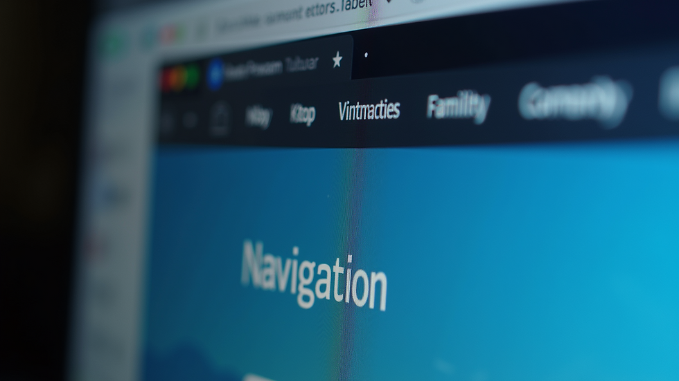
1. Clear Navigation
Nothing kills the vibe faster than hunting for the menu or getting lost in endless subpages. A straightforward menu with clear labels like “Attractions,” “Reviews,” “Events,” and “Shop” helps visitors find what they want in seconds.
2. Fast Loading Times
Ghosts might be quick, but slow websites are just frustrating. Compress images, minimize scripts, and choose reliable hosting to keep things zippy.
3. Mobile Responsiveness
Most of us browse on phones these days. If your site looks like a jumbled mess on a small screen, you’re losing a ton of potential fans.
4. Readable Fonts and Colors
Dark themes are perfect for haunted vibes, but make sure text contrasts well and fonts are easy to read. No one wants to squint through spooky shadows.
5. Intuitive Calls to Action (CTAs)
Buttons like “Buy Tickets,” “Join Newsletter,” or “Explore More” should stand out and be easy to click. Don’t make visitors guess what to do next.
6. Search Functionality
For a site packed with reviews and events, a search bar is a lifesaver. It lets users jump straight to what interests them.
7. Accessibility Features
Think about visitors with disabilities. Alt text for images, keyboard navigation, and screen reader compatibility make your site welcoming to all.
By focusing on these elements, you create a seamless experience that keeps visitors coming back for more haunted fun.
Which is the Most User-Friendly Website Builder?
If you’re thinking, “Okay, I get it. But how do I build a site like this without hiring a tech wizard?”—you’re in luck. There are plenty of website builders designed for folks who want powerful results without the headache.
Here are some top contenders that balance ease of use with customization:
Wix
Drag-and-drop interface that’s super intuitive.
Tons of spooky-themed templates perfect for haunted attractions.
Built-in SEO tools to help your site get found.
Mobile-friendly designs out of the box.
Squarespace
Sleek, modern templates that look professional.
Great for showcasing photos and merchandise.
Easy-to-use blogging platform for sharing haunt stories.
Reliable hosting and security.
WordPress.com
More flexible if you want to grow big.
Thousands of plugins for everything from ticket sales to event calendars.
Slightly steeper learning curve but worth it for customization.
Shopify (for Merch)
If selling haunted merch is your main goal, Shopify is a powerhouse.
Simple setup for online stores.
Secure payment options and inventory management.
Personally, I’ve played around with Wix and Squarespace for smaller projects, and they’re fantastic for getting a polished site up quickly. If you want to dive deeper, WordPress is the way to go, but be ready to invest some time learning the ropes.
No matter which builder you choose, remember the goal: keep it simple, clear, and spooky-cool.

How to Implement User-Friendly Web Design on Your Haunted Attraction Site
Alright, so you’ve picked your builder and you’re ready to roll. Here’s a step-by-step guide to making your site a user-friendly haunt haven:
Step 1: Plan Your Site Structure
Sketch out the main pages and how they link together. Think about what visitors want most—maybe a homepage with featured attractions, a review section, an event calendar, and a shop.
Step 2: Choose a Theme or Template
Pick one that fits your spooky vibe but doesn’t sacrifice clarity. Avoid cluttered designs that overwhelm visitors.
Step 3: Optimize Images and Media
Use high-quality photos but compress them to keep loading times fast. Add alt text to every image for accessibility and SEO.
Step 4: Write Clear, Engaging Content
Keep sentences short and punchy. Use headings, bullet points, and bold text to break up info. Inject personality—after all, haunted attractions are all about atmosphere.
Step 5: Set Up Easy Navigation
Create a menu that’s visible on every page. Use dropdowns sparingly and label everything clearly.
Step 6: Add Calls to Action
Make it obvious what you want visitors to do next. Whether it’s buying tickets or signing up for a newsletter, your CTAs should pop.
Step 7: Test on Multiple Devices
Check how your site looks on phones, tablets, and desktops. Fix any layout issues or slow-loading elements.
Step 8: Gather Feedback and Iterate
Ask friends or fellow haunt fans to try your site and give honest feedback. Use their insights to tweak and improve.
By following these steps, you’ll create a site that’s not just functional but a joy to explore.
Why I Believe User-Friendly Design Is a Game-Changer for Haunt Seekers
I’ve been around the haunted block enough to know that the best scares come with the best experiences. Haunt Seekers is on a mission to be the premier national media platform for haunted attraction reviews and paranormal exploration. But to do that, it needs to connect with fans in a way that feels effortless and exciting.
That’s where user-friendly web design comes in. It’s not just about looking good—it’s about making sure every visitor can find the info they crave, buy merch without hassle, and feel part of a growing community.
When a site works well, it builds loyalty. Fans come back, share their experiences, and bring new people into the fold. It’s like lighting a candle in a dark room—suddenly, everything feels more inviting.
So, if you’re involved in the haunt world or just love exploring spooky sites, remember: a user-friendly website is your best friend. It’s the gateway to more thrills, chills, and unforgettable moments.
Ready to explore more haunted attractions or snag some eerie merch? Dive into a site that truly gets it—where user-friendly design meets paranormal passion. Your next ghostly adventure is just a click away.


Comments